Wednesday, September 15, 2010

Symbol Methodology


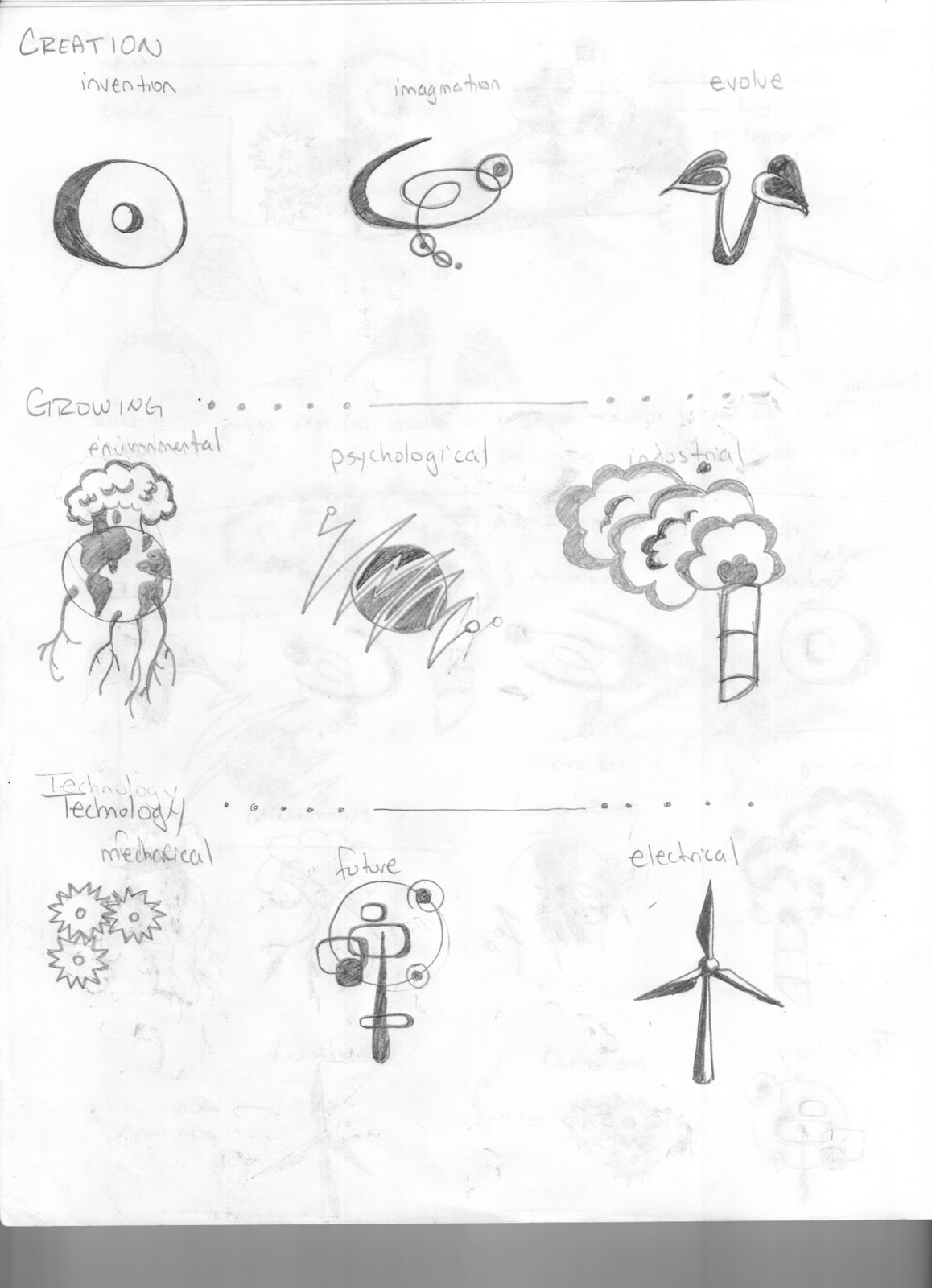
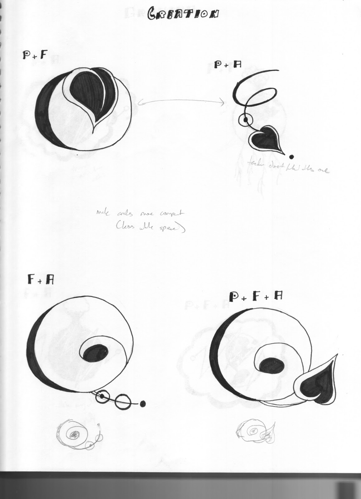
     The goal of the symbol methodology project was to create 3 completely unique symbols to describe one word from a list of industries/disciplines given by the teacher. The goal in mind was not only to create something completely unique, but also to make sure it was readable if scaled down to 1".

    I took the word "Manufacturing" and split into 3 sub-categories: technology, creation, and growing. In each of these, i broke them down into 3 more sub-categories. Technology: mechanical, future, electrical. Creation: invention, imagination, evolve. Growing: environmental, psychological, industrial.

    I then took the images and tweaked them on paper until I was satisfied with the symbols. Then, when the final products were created, I scanned the sketches and vectorized them in Adobe Illustrator to create the final 2 sheets (3 options to choose from before the final). The final board is the bottom-most image.

Friday, September 10, 2010

Scavenger Hunt


This project was an Image Methodology assignment. There were several steps to the process including understanding formal elements of color, value, line, shape (or form), pattern, and space. With these concepts in mind, we were to go out and selectively photograph objects/people/places etc that best represented these elements. 
     Next, we were asked to, within our pictures, find elements that connected the pictures. For example if you had an orange and an apple, you could frame them so that shape could visually connect the pictures. As shown, my pictures linked to each other using line, space, color, space,  and shape. I learned a small amount of css to create the background color and name the photos online using TextWrangler. The photos were all edited in Adobe Photoshop.
     The final pictures were put online (http://myweb.stedwards.edu/hwhite5/imgmeth/) in a slideshow type format that allowed the viewer to scroll across the pictures.

Wednesday, August 25, 2010

Illustrator Exercise - Duck

     The duck project was my first project in Graphic Design I -- using the image on the left, we were to use the pen tool in Adobe Illustrator to recreate the duck using outlines and color. The image on the right is my final product, and I used the eyedropper tool to pinpoint exact colors, and the layering tool to help place certain shapes on top of others.

Wednesday, May 5, 2010

Type Specimen Book


     This project was meant to teach book making skills (including crop marks, saddle stitch, and making colors print the way you want on screen), being able to follow a common theme throughout the book, be able to bring out text from a selected source of material that compliments the chosen type face, and being able to create and follow a successful organizational pattern.

You can find a PDF version HERE

     The typeface I chose was Mrs. Eaves, and I used a plaid organization with lots of colors on each page. The tricky part of this project for me was trying to make certain colors work with each other and getting them to print out successfully. The cover was created in Adobe Illustrator and imported to Adobe InDesign (where the rest of the book was created). The book was bound together using a saddle-stitch method.

Monday, March 15, 2010

Design Culture Now


     This project's goal was to use Adobe Illustrator to create a poster using given text. Things learned included: tiling, color matching from screen to printer, organization, design concepts that were professional and successful for a poster. Neatness was also a crucial part of this project. What I was going for in my poster was a color palette emerging from a grey center (or lack of color).