Saturday, December 4, 2010

Personal Geography - Cognitive Map

The goal of this project was to successfully use symbols to communicate something. In this case we were to create a map from home to school (or school to work or any one path during our day) and explain this path using a cognitive map.


The first version of the map:
What made this map unique was the fact that it was user interactive; a user would slide the tabs to reveal what they would do in the morning. From that choice, they were sometimes limited on the next choice they could choose (e.g. if I sleep in, I don't have the option to eat breakfast).

The final map:
The final map has the tabs laminated to allow easier slide-ability as well as preventing unnecessary bending of the paper from use. Because there was such a large empty space on the tabs, I added a little phrase:
Advance through my thoughts, a map of my mind. To follow the path move down then side to side. If the path chosen has a spotlight of color, follow it down and connect it to the other. No path? No problem! Choose one and keep going. If "the end" is reached, admire your choices and go back! And begin again.

I created each section in Adobe Illustrator before printing them and assembling them. The tabs were laminated at Kinkos.


Tuesday, November 23, 2010

Personal Geography - Perceptual Map

The goal of this project was to successfully use symbols to communicate something. In this case we were to create a map from home to school (or school to work or any one path during our day) and explain this path using a perceptual map.


The first version of the map:
I used pure color with this one, and I liked the idea of having ray-like senses expanding from one point. However it was pointed out to me that the radial progression didn't make sense, so I took my idea in a different direction.

The final map turned in:
This map had a definite start and stop point and the senses were not only clearly marked by color, but also with symbols that helped identify what the sense was experiencing at the moment. This map helped me reshape the first map and the final map - cognitive.

I created both images in Adobe Illustrator.


Monday, November 8, 2010

Material Studies

     The goal of this project is to "study the creative possibilities of materials by creating a typeface from some material of your choice" I need to find 3 types of objects that can be molded into typefaces and then choose the best one to showcase the typeface.

This picture is the final product. I chose the word "Twang" for my rubber band typeface, and tried to mimic someone playing with rubber bands at work/home when bored. The yellow rubber bands contrast against the blue rubber bands and allow readability when tweaked in Adobe Photoshop. The above photo was printed on an 18"x24" sheet for the final.

 I used Adobe InDesign to create the PDF for the Process Book in which I document the process of creating this final image.

Saturday, October 23, 2010

Personal Geography - Artifact Map

The goal of this project was to successfully use symbols to communicate something. In this case we were to create a map from home to school (or school to work or any one path during our day) and explain this path using an artifact map.

The first artifact map I turned in:
In this map, because the distance between school and home is so large and boring, I tried to explode the school and home sections of the map. 

The final artifact map I turned in:
In this map, I decided that exploding the sections didn't add the appeal I wanted. By the time I edited this map, I had also figured out the color palette I desired for all three maps and used that palette to help give my map definition. I created both maps in Adobe Illustrator.

Monday, October 18, 2010

Critical Mass

  The object of this project is to build up, through creating and experimenting, a large amount of material and piecing them together using After Effects skills. Then, we are to create a 45 second HD movie (or less) that is an allegory of a science concept: earthquake, volcano, photosynthesis, climate change, reproduction, or evolution.


11/3: finally finished the movie! Using play-doh, I made a stop motion movie representing reproduction in an allegorical way - i had the colors of play-doh mix to create a third color (or a child). I also added in some vector art to give it another dimension, and the soundtrack is all thanks to Mike McNeil. It really adds another dimension to the movie and it wouldn't be nearly close to what it is now without his help. The video was taken with a camera and then the images and audio were pulled together in Adobe After Effects to create the final composition above.

Thursday, October 14, 2010

Interaction Exercise

     This project was an interactive exercise using flash. We used our symbols project as our topic and picked one of the three branches to do our movie on (see blog entry titled Symbol Methodology). I used the branch of Manufacturing called Creation for my movie, and showed a gradual progression through the brainstorming process from written ideas, to sketches, to final drawings. In flash I used mainly fading in and out with little movements to help emphasize certain progressions. Halfway through my movie I give the viewer a chance to interact and choose the correct symbol, as well as added a replay button at the end. 
     In order to fully take advantage of this project, I had to learn small amounts of ActionScript, as well as how to use different Flash features including color, creating graphics/buttons, layers, movement, Alpha, and Fade in/out. 

Tuesday, October 5, 2010

Scales


     This was a Photoshop exercise to help us practice using our use of selection tools as well as creatively being able to put things together in a limited amount of time. We were told to spend no longer than 30 minutes on each piece, and we were given a large list of questions, in which the instructor would pick a number of them to answer each day. Not only were we given these limits, but also we had to follow certain design styles each day as well. 

Wednesday, September 15, 2010

Symbol Methodology


     The goal of the symbol methodology project was to create 3 completely unique symbols to describe one word from a list of industries/disciplines given by the teacher. The goal in mind was not only to create something completely unique, but also to make sure it was readable if scaled down to 1".

    I took the word "Manufacturing" and split into 3 sub-categories: technology, creation, and growing. In each of these, i broke them down into 3 more sub-categories. Technology: mechanical, future, electrical. Creation: invention, imagination, evolve. Growing: environmental, psychological, industrial.

    I then took the images and tweaked them on paper until I was satisfied with the symbols. Then, when the final products were created, I scanned the sketches and vectorized them in Adobe Illustrator to create the final 2 sheets (3 options to choose from before the final). The final board is the bottom-most image.

Friday, September 10, 2010

Scavenger Hunt


This project was an Image Methodology assignment. There were several steps to the process including understanding formal elements of color, value, line, shape (or form), pattern, and space. With these concepts in mind, we were to go out and selectively photograph objects/people/places etc that best represented these elements. 
     Next, we were asked to, within our pictures, find elements that connected the pictures. For example if you had an orange and an apple, you could frame them so that shape could visually connect the pictures. As shown, my pictures linked to each other using line, space, color, space,  and shape. I learned a small amount of css to create the background color and name the photos online using TextWrangler. The photos were all edited in Adobe Photoshop.
     The final pictures were put online (http://myweb.stedwards.edu/hwhite5/imgmeth/) in a slideshow type format that allowed the viewer to scroll across the pictures.

Wednesday, August 25, 2010

Illustrator Exercise - Duck

     The duck project was my first project in Graphic Design I -- using the image on the left, we were to use the pen tool in Adobe Illustrator to recreate the duck using outlines and color. The image on the right is my final product, and I used the eyedropper tool to pinpoint exact colors, and the layering tool to help place certain shapes on top of others.

Wednesday, May 5, 2010

Type Specimen Book


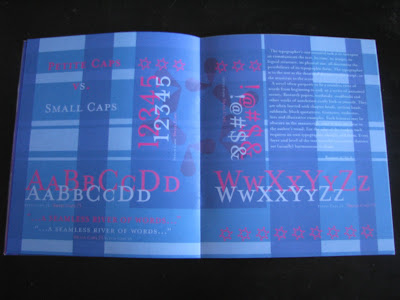
     This project was meant to teach book making skills (including crop marks, saddle stitch, and making colors print the way you want on screen), being able to follow a common theme throughout the book, be able to bring out text from a selected source of material that compliments the chosen type face, and being able to create and follow a successful organizational pattern.

You can find a PDF version HERE

     The typeface I chose was Mrs. Eaves, and I used a plaid organization with lots of colors on each page. The tricky part of this project for me was trying to make certain colors work with each other and getting them to print out successfully. The cover was created in Adobe Illustrator and imported to Adobe InDesign (where the rest of the book was created). The book was bound together using a saddle-stitch method.